
The Software Names the Options Market Hasn’t Priced Yet
Software Is Dead. Long Live Silicon. Part 2 — What the Options Chain Says

This is post 3 in the Tech Schism series, where I’m arguing that the tech “sector” has fractured into two economies that don’t behave the same anymore — and that the market is starting to price the fracture, but not by enough.
Previous posts:
Part 1: QQQ Is Lying to You opened the argument by showing SMH and IGV have decoupled 87 points YTD inside a QQQ that looks calm on the surface.
Part 2: The Correlation Trade Is a Trap explained why the obvious pairs trade fails, and what the real trade is.
Part 3: The Software Names Getting Crushed by GPU Depreciation laid out the mechanism: hyperscaler AI capex is transferring 800 to 1,100 basis points of margin from software to silicon over the next three years, on a straight-line depreciation schedule.
This post is the market-in-motion companion. Fresh data pulled this week on how the vol surface is currently pricing the mechanism the last post laid out. Where the market has done the work, where it hasn’t, and where the gap looks tradeable.
Summary ~200 Words
The thesis. The mechanism argument from the last post is one story and what the options market is currently pricing is a second story, and this post is about where the two disagree.
The dispersion. Across the same 14 software names ranked last week, current 25-delta put skew ranges from +3.03 vol points (CRM) to –7.01 vol points (INTU), which is a 10-vol-point spread across a group with broadly similar exposure to the same mechanism. Names with higher vulnerability scores are trading with cheaper downside protection than names with lower scores, which means the cross-section is telling on itself.
The Alphabet tell. Among the Big 4 capex payers plus Oracle, four of five names carry front-end vol that lines up cleanly with earnings calendars over July 22–30, but Alphabet’s front-end is elevated without a full earnings hump — the mid-tenors don’t recover the way MSFT, META, and AMZN’s do — which means the options market is pricing something at Alphabet that isn’t the print.
The NVDA setup. NVDA’s 30-day realized volatility versus MSFT’s is at the 8th percentile of the trailing 12 months, meaning NVDA has been anomalously quiet, which is the setup for Post 3 rather than a trade today.
Now the detailed read. Github links with code and CSVs at the bottom.
Fourteen Names, Ten Vol Points, One Mechanism
We have fourteen names and roughly ten vol points of dispersion through presumably one mechanism. The mechanism, from last week, is that hyperscalers are moving GPU purchases through the P&L as depreciation on faster useful-life schedules than the previous generation of infrastructure, and the software layer that resells or depends on that compute has to absorb the pricing pressure. The vulnerability ranking sorted 14 names into Capex Payers who own the burden directly (MSFT, ORCL), Compute Renters who consume it (SNOW, DDOG, ZS, MDB, PANW, NOW, CRM, WDAY, TEAM, HUBS), and two differentiated names the market is already treating as different (ADBE, INTU).
If the options market believed the mechanism argument in a uniform way, the 14 names would line up diagonally on the chart below — higher vulnerability, richer downside protection. Instead the scatter is messy, and messy in a specific direction:
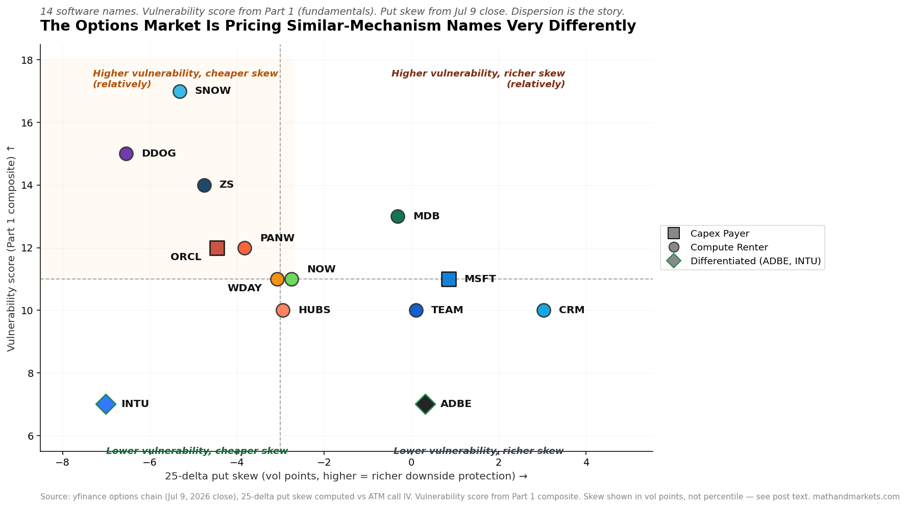
The y-axis is the vulnerability score from the last post and the x-axis is where 25-delta put skew is trading as of the July 9 close. SNOW sits at the top of the vulnerability ranking with put skew of –5.32 vol points, while MSFT with a lower vulnerability score has put skew of +0.85 vol points, which means the market is pricing MSFT’s downside more expensively than SNOW’s on a name that the fundamental work says is more exposed to the mechanism, not less. That inversion — high vulnerability paired with cheap protection, low vulnerability paired with expensive protection — shows up more than once in the chart and it’s the whole trade thesis for this post.
The Honest Caveat
Some of this dispersion is real signal and some of it is regime. CRM has always traded rich skew because it’s an activist story with structural chop, and INTU has always traded flat skew because it’s a low-beta staples-like name, so their positions on the chart partly reflect their own histories rather than any current market view on the mechanism. What can’t be done with this data is comparing each name’s current skew to its own history, since that requires a paid implied-vol surface source we don’t have here.
Cross-sectional dispersion is a legitimate signal on its own but it isn’t the same as saying “SNOW puts are cheap in absolute terms” — it’s saying SNOW puts are cheap relative to how the market is pricing the same mechanism elsewhere in the same tape. That distinction matters and everything below is written with it in mind.
The 10-Vol-Point Spread
Sorting all 14 names by put skew makes the pattern sharper than the scatter does:
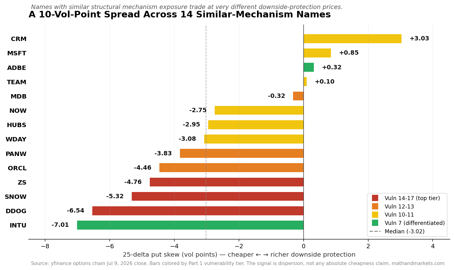
The color coding is the vulnerability tier from the last post, with red being the top tier. The red bars are sorted to the wrong side of the chart — the names with the highest fundamental exposure to the mechanism (SNOW, DDOG, ZS) sit at the flat-skew end where downside protection is cheap, while the names with lower fundamental exposure (CRM, MSFT, ADBE) sit at the rich-skew end. INTU is the exception at the flat end but that’s a regime story since INTU is always flat-skew. The dispersion isn’t random noise — it runs against the mechanism direction with enough consistency to want an explanation.
There are two reasonable explanations. The first is that the market has already discovered the mechanism and priced it into the Capex Payers who report earnings first, while the Compute Renters haven’t gotten repriced yet because their calendars are further out and they haven’t been forced to speak on the record about margin implications. This is the “market hasn’t gotten to them yet” thesis and it says the flat-skew high-vulnerability names are the setup, since the dispersion should close as SNOW, DDOG, and ZS’s next earnings cycles force pricing. The second explanation is that the market is right and the last post was wrong — the Compute Renters are getting priced as usual-story growth-vol names, and the fundamental work overweights the depreciation pass-through because it doesn’t account for whatever offset the SaaS layer has (price hikes, product upsell, workload growth). If the second read is right, the dispersion holds and there’s no trade.
The first explanation looks stronger for the specific names where the mechanism was tightest last week (SNOW, DDOG, MSFT), but the second stays live for the middle names where the fundamental argument was weaker to start.
The Alphabet Anomaly
The Capex Payers report earnings inside a nine-day window — GOOGL on July 22, MSFT on July 29, META on July 29, AMZN on July 30 — and front-end implied vol at all four names is elevated, which is normal because the front expiry captures the print, vol richens into it, and then it collapses after. What isn’t normal is the difference in shape across the four names:
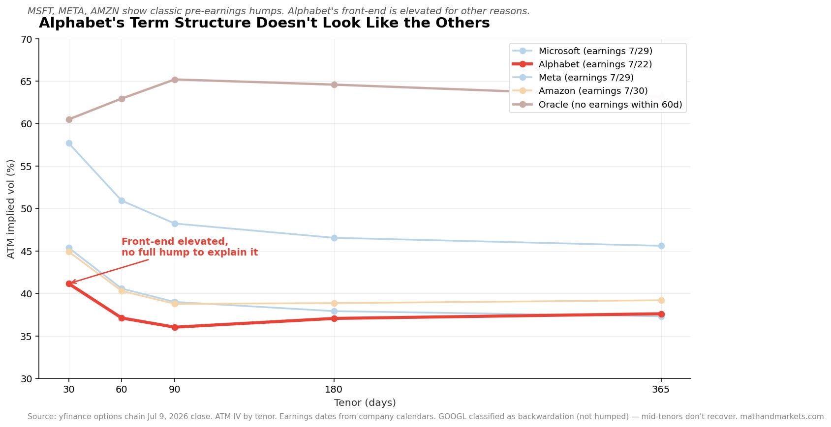
MSFT, META, and AMZN all show the classic pre-earnings hump: front-end elevated, vol drops sharply at 60-90 days, then a slow rebuild to structural levels. Oracle has no earnings within 60 days and shows clean contango — a normal upward-sloping curve with no event distortion. Alphabet’s curve looks like none of them.
At 30 days, GOOGL is at 41.16%, which is elevated versus its 90-day tenor at 36.03% — a 5.13 vol-point spread. Normal earnings behavior would produce a hump where the front-end is rich, the mid-tenors are depressed, and the back-end is normal, but GOOGL doesn’t hump. The mid-tenors stay depressed. The 180-day is at 37.06% and the 365-day is at 37.61%, so the curve is genuinely inverted at the front rather than just around the print.
That’s what makes it interesting. Front-end elevation that persists past the print date suggests the options market is pricing something at Alphabet that isn’t the earnings event, and the candidates are all real: positioning around the antitrust remedy timeline, macro concentration risk if the market thinks GOOGL is the swing factor on AI capex disclosure, or a client with a large hedge sitting in the tape. We don’t know which one it is, but we know it’s there.
The actionable version is to watch what Alphabet’s 30-day IV does after the July 22 print. If it collapses to match MSFT/META/AMZN’s post-earnings vol, it was earnings after all and the shape was a coincidence. If it stays elevated, the market is telling us there’s a second story at GOOGL that the mechanism analysis didn’t capture.
The NVDA/MSFT Setup
The mechanism argument transfers margin from the software layer to the silicon layer, and the natural expression of that thesis in options space is a long NVDA vol / short MSFT vol trade — or the reverse, depending on how the market has already priced it.
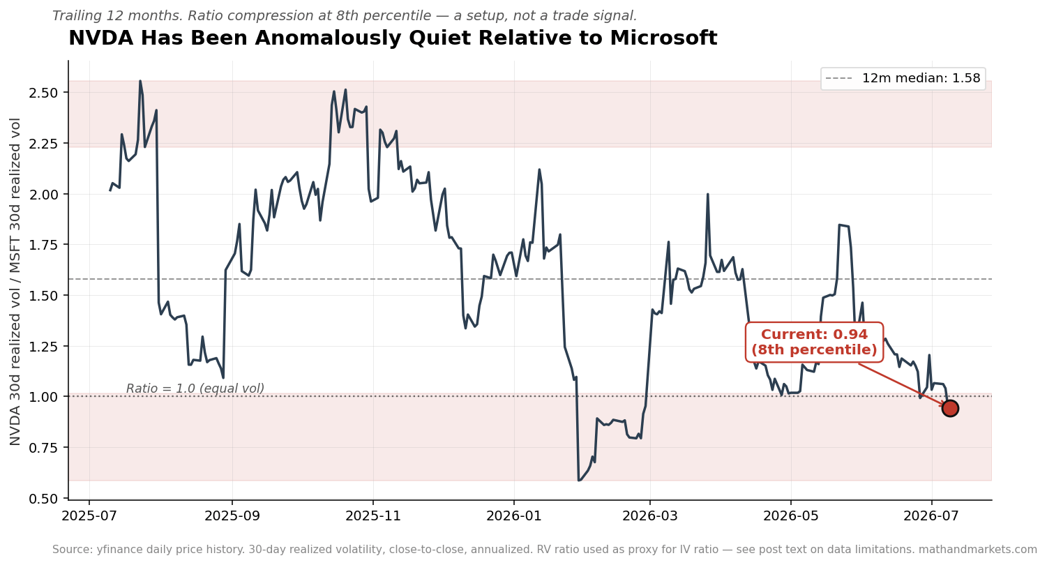
The chart above is the ratio of NVDA’s 30-day realized volatility to MSFT’s 30-day realized volatility over the trailing 12 months. It’s currently at 0.94, meaning NVDA has been less volatile than MSFT on a realized basis for the last 30 days, which is at the 8th percentile of the trailing year against a 12-month median of 1.58. NVDA has been quiet in a way that its own history says is unusual.
The honest note is that this is 30-day realized vol rather than implied vol. The RV ratio lags the IV ratio by 2-4 weeks in trend changes and doesn’t capture event premium, so Post 3 will need paid implied-vol data to confirm the signal. What we have here is a directional starting point rather than a trade recommendation. But the direction is interesting: if NVDA is at the 8th percentile of its normal vol premium over MSFT, one of three things is happening — NVDA is entering a low-vol regime that persists (unusual for the name), MSFT is entering a high-vol regime (plausible given the capex disclosure calendar), or the ratio is coiled and about to snap back toward the 1.58 median. The trade construction in Post 3 will pick a side.
What to Do With This
No positions in any of these names before this post publishes, but here’s what’s worth watching. The cleanest setup is SNOW, DDOG, and ZS — highest vulnerability, cheapest cross-sectional put protection — where the dispersion should close on their next earnings prints (SNOW reports late August, DDOG early August, ZS mid-August). If the dispersion doesn’t close on those prints, the second explanation wins and this post owes a public update. The Alphabet call needs one more datapoint before it becomes actionable: if the 30-day IV doesn’t compress after the July 22 print, the front-end elevation is structural and worth trading, but if it compresses, the shape was earnings and there’s no trade.
On the other side, MSFT and CRM sit at the top of the skew ranking, which means the mechanism argument is already priced into their downside vol. Long puts here are expensive, so any trade in those names should be structured (put spreads, ratio spreads, calendar spreads) rather than outright long puts. ADBE and INTU are the differentiated names from last week and nothing in the options data disagrees — ADBE trades rich skew because it’s expensive-vol by history, INTU trades flat because it’s low-beta, and both readings are consistent with the differentiation call.
Sources: yfinance options chain (July 9, 2026 close) for 30/60/90/180/365-day ATM implied vol and 25-delta put skew across the 14 names. yfinance daily price history for the trailing 12-month NVDA and MSFT realized volatility series (30-day close-to-close, annualized). Vulnerability scores carried forward from the mechanism post’s composite ranking. Term-structure classification (contango, backwardation, humped) applied per-name based on tenor shape, cross-referenced against upcoming earnings calendars. All options data as of the market close of July 9, 2026; analysis performed July 11, 2026. RV ratio used as a proxy for the IV ratio in the NVDA/MSFT setup — the IV confirmation requires a paid vol-surface source and is deferred to Post 3. Cross-sectional put skew comparisons are stated in vol points, not percentile within each name’s own history; a percentile-based rework would reclassify some names between the “cheap” and “regime” buckets.
Full code and analysis available at: https://github.com/kniyer/software-vs-silicon
Post 3 the following Saturday — July 25 — is the trade writeup. Long NVDA, short MSFT, sized by capex intensity rather than realized vol, with the exact position math, the four ways the trade breaks, and the specific stop and exit conditions. It’s a fundamental thesis expressed as a pair, not a correlation edge with a fundamental story tacked on.
Between now and then, Alphabet reports on July 22 and the Alphabet term-structure question above will resolve one way or the other before Post 3 publishes. That resolution will be in Post 3.
As always, the material presented in Math & Markets is for informational purposes only. It does not constitute investment or financial advice.
Alpha is never guaranteed and the backtest is a liar until proven otherwise.
Seriously, your stuff never disappoints! Great article 👏👏
Good catch on the Alphabet front end. The residual vol sits on a different clock than the July 22 print, which is why stripping the earnings date doesn't clear it. The EU DMA fine for search self-preferencing is teed up at the Commission with compliance orders due around July 27, so that binary resolves after earnings, not on them.
Layer this morning's Gemini 3.5 delay, coding weakness versus Anthropic and OpenAI, and you've got a competitive-position question the call can't put to bed either. The July 2 Android decision going final also opens a rival damages tail. None of that collapses on the 22nd. That's your persistent front-end elevation. Framework holds up.