
The Plumbing Beneath the Price: Order Flow, Toxicity, and the Signals Most Traders Ignore
Part 83 — Microstructure Edge Series 1 of 4 — VPIN, Kyle’s lambda, bid-ask decomposition, and why the spread knows more than the chart

This is part 83 of my series — Building & Scaling Algorithmic Trading Strategies
This begins a 4-part series on market microstructure — the physics of how prices actually form. Part 1: the signals // Part 2: open/close auction mechanics // Part 3: dealer gamma exposure // Part 4: building a microstructure signal layer for V6.
The Signal You’re Not Looking At
Almost every stock chart we read is effectively a culmination — in some ways, it’s a lie by omission.
Not because the price is wrong — it’s accurate — but rather, the price is the last thing to move. Before the price drops, the order flow shifts. Before the order flow shifts, the spread widens. Before the spread widens, the limit order book thins out on one side.
If price is the smoke, microstructure is the fire.
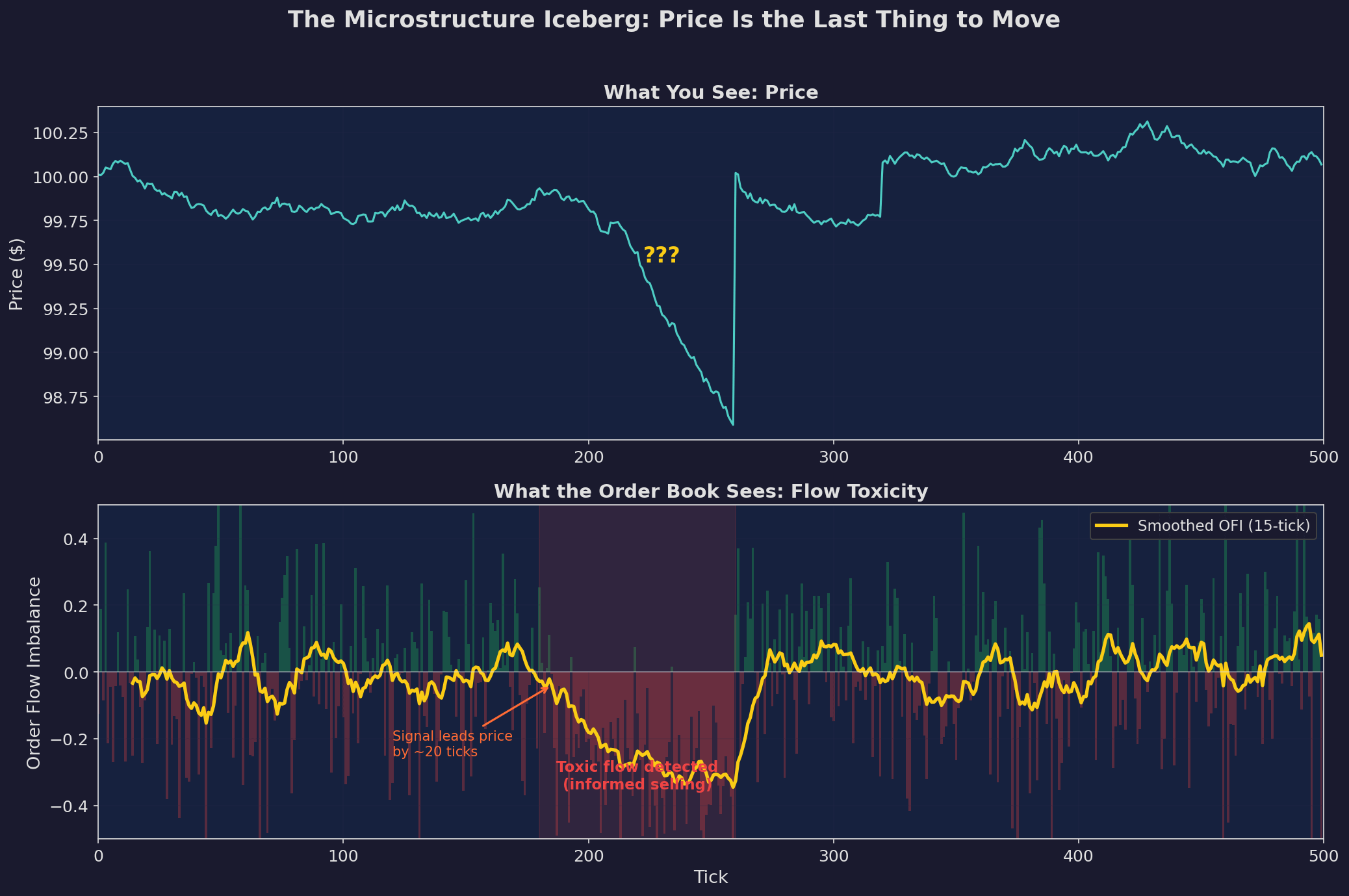
Top: the price chart. At tick 200-ish, it drops. If you’re watching the chart, you see this after it happens. Bottom: the order flow imbalance. Sell pressure starts building around tick 180 — roughly 20 ticks before the price move is visible. The smoothed OFI (yellow) turns sharply negative while the price chart still looks normal.
This is not theoretical. Market makers have been trading on this information for decades. The academic literature — Kyle (1985), Glosten and Milgrom (1985), Easley and O’Hara (1992) — formalized what floor traders already knew: you can hear the market shift before the price moves.
The question for us: can a retail quant use any of this?
Kyle’s Lambda: The Price of Information
In 1985, Albert Kyle published a model that became the foundation of market microstructure theory. The core insight is elegantly simple:
Price impact is proportional to order flow.
ΔP = λ · (Buys - Sells) + noiseWhere λ (lambda) is the “price impact coefficient” — the market’s sensitivity to net order flow. Lambda captures something deep: it’s the market maker’s estimate of how much information is embedded in the flow.
When λ is high, the market is saying: “I think some of you know something I don’t, so I’m going to move the price more aggressively in response to orders.”
When λ is low, the market is saying: “This looks like random noise, I’ll absorb it without moving much.”
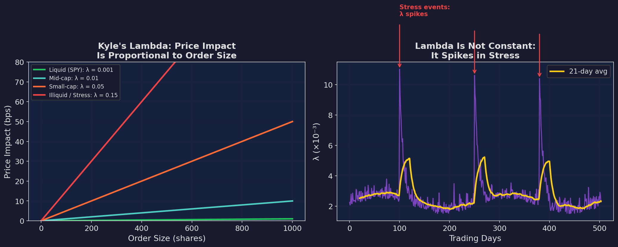
Left: the linear price impact model. In liquid markets (SPY), you can trade 1000 shares with ~1 bps of impact. In illiquid or stressed markets, the same order moves the price 15x more. Right: lambda is not constant — it spikes during stress events. This is why execution costs blow up precisely when you need to trade most urgently.
Why Lambda Matters for You
Even if you never estimate λ directly, it explains two phenomena you’ve experienced:
1. Slippage is worst when you need to trade. During the exact periods where your strategy signals a regime change and you want to rebalance, λ has spiked. The cost of executing the trade partially offsets the benefit of the signal.
2. Backtest transaction cost assumptions are wrong. Most backtests use a fixed transaction cost (say 5 bps). But λ varies by 10-20x between calm and stressed markets. Your worst trades — the ones in crises — have the highest costs, and your backtest understates them.
Estimating Lambda
The simplest estimator, following Hasbrouck (2009):
λ̂ = Cov(ΔPₜ, sign(Qₜ)) / Var(sign(Qₜ))Where ΔP is the price change and sign(Q) is the direction of the trade (+1 for buyer-initiated, -1 for seller-initiated). You can compute this with daily data from WRDS or even from publicly available trade-and-quote data.
For SPY, λ typically runs around 0.5-2 bps per standard deviation of net flow in calm markets, rising to 5-15 bps during stress. I’ll show the exact computation in Part 4 when we build the signal layer.
VPIN: The Flash Crash’s Early Warning System
VPIN — Volume-Synchronized Probability of Informed Trading — was introduced by Easley, López de Prado, and O’Hara in 2012. It gained attention because it rose dramatically in the hours before the May 6, 2010 Flash Crash.
The Intuition
VPIN measures the imbalance between buy-initiated and sell-initiated volume, normalized by total volume, computed over volume buckets rather than time buckets. The volume-synchronization is the key innovation: instead of sampling every minute or every day, you sample every time a fixed amount of volume has traded.
Why? Because informed traders cluster their activity in high-volume periods. If you sample by time, you might miss 80% of the information in a burst of trading. If you sample by volume, each observation carries roughly the same amount of information.
The Math
Divide the trading day into N volume buckets, each containing V_bucket shares. For each bucket n:
V_buy(n) = volume classified as buyer-initiated
V_sell(n) = volume classified as seller-initiated

VPIN = (1/N) · Σₙ |V_buy(n) - V_sell(n)| / V_bucket
VPIN ∈ [0, 1]. When VPIN = 0, buying and selling are perfectly balanced (uninformed flow dominates). When VPIN approaches 1, flow is completely one-sided (likely informed).
VPIN in Action
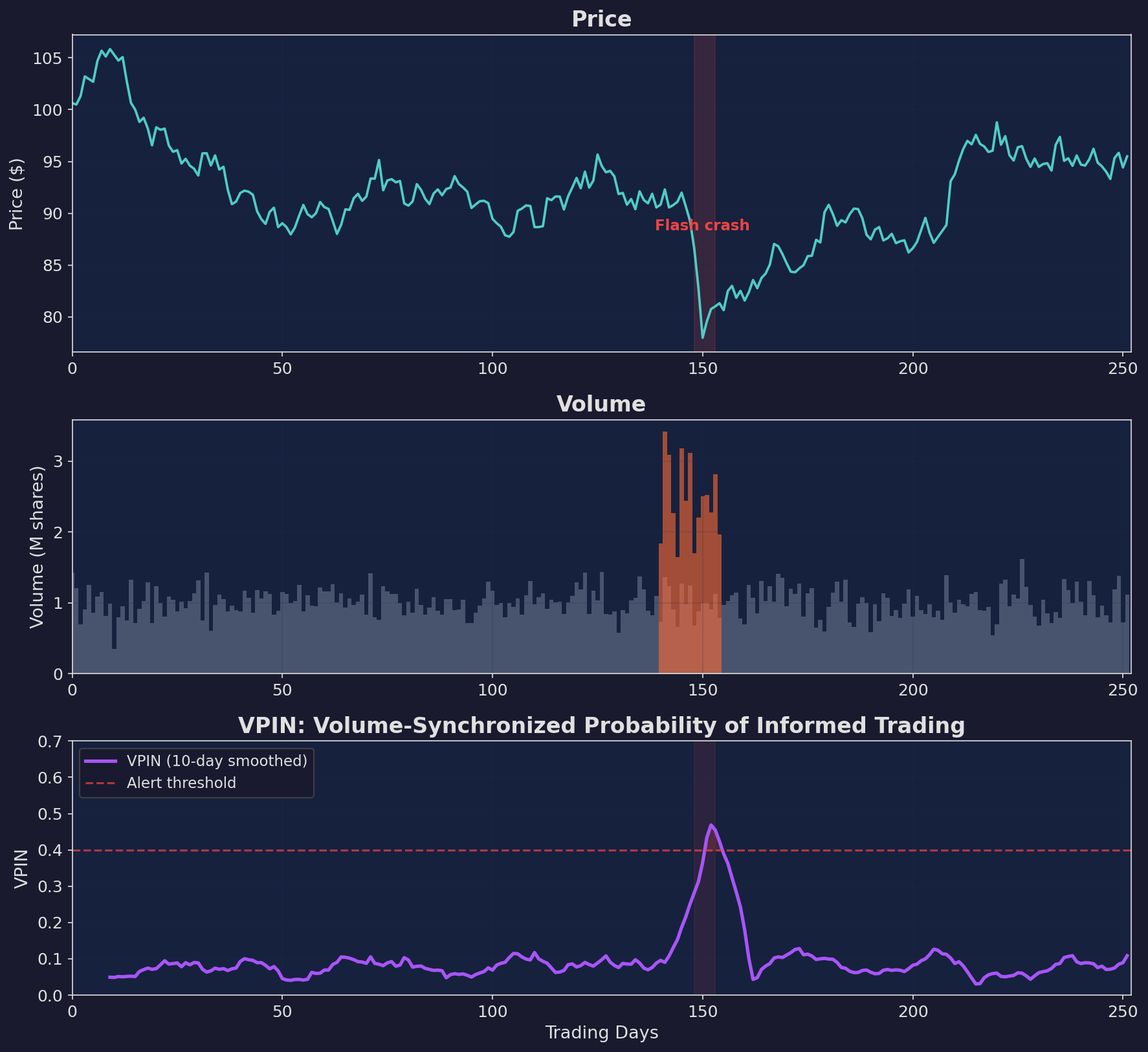
Three panels showing a simulated flash crash at day 150. The price drops suddenly (top). Volume spikes (middle). VPIN crosses the alert threshold at 0.4 as the crash hits (bottom). In the original Easley et al. study, VPIN on real E-mini S&P 500 futures rose to elevated levels hours before the 2010 Flash Crash — offering a warning that price alone did not.
The Controversy
VPIN is not without critics. Andersen and Bondarenko (2014) argued that VPIN’s predictive power comes largely from its correlation with volatility, and that simpler vol measures perform comparably. The debate continues, but the core insight is robust: volume-weighted flow imbalance contains information that time-weighted measures miss.
For our purposes, the practical question isn’t “is VPIN the best metric?” — it’s “does flow imbalance predict anything useful at the daily/weekly horizon where V6 operates?” I’ll test this in Part 4.
The Bid-Ask Spread: Three Stories in One Number
The spread is the most visible microstructure signal — you see it every time you place a trade. But most people think of it as a transaction cost. It’s actually a compressed information signal.
The spread decomposes into three components, each telling a different story:
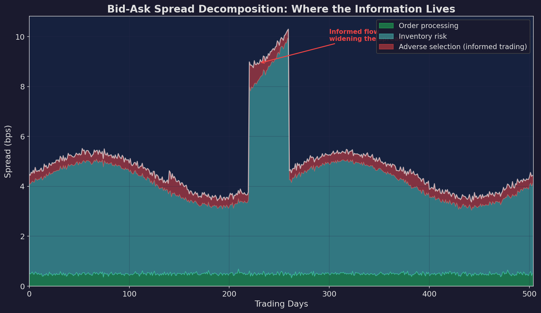
Green (bottom): order processing cost — the fixed cost of running a market-making operation. Relatively constant. Blue (middle): inventory risk — the market maker’s cost of holding a position. Rises with volatility. Red (top): adverse selection — the market maker’s cost of trading against informed participants. This is where the information lives.
The Three Components
1. Order processing cost (~0.3-0.5 bps for SPY). The infrastructure cost. Declines over time with technology.
2. Inventory risk (~1-4 bps, vol-dependent). The market maker holds a position and faces price risk. This scales with volatility — when VIX doubles, the inventory component roughly doubles.
3. Adverse selection (~0.3-1.5 bps, information-dependent). This is the market maker’s compensation for getting picked off by informed traders. When a market maker sells to a buyer who has material non-public information, the market maker loses. The adverse selection component of the spread reflects the market maker’s estimate of how likely this is.
Why You Should Care
The adverse selection component is the market’s real-time estimate of information asymmetry. When it spikes, someone knows something.
Formal decomposition requires TAQ (trade and quote) data and methods like Huang and Stoll (1997) or the more recent LOBSTER dataset. But even the total spread — which you can get from any broker — carries signal.
The Spread Predicts Returns
Wide spreads predict negative future returns. This is one of the most robust findings in microstructure research, documented by Amihud and Mendelson (1986), Pastor and Stambaugh (2003), and Acharya and Pedersen (2005).
The mechanism: when spreads widen, it means market makers are uncertain. They’re either (a) seeing informed flow, (b) facing high inventory risk, or (c) both. In either case, the expected near-term price path is negative — either because informed sellers are right, or because the liquidity withdrawal itself pushes prices down.
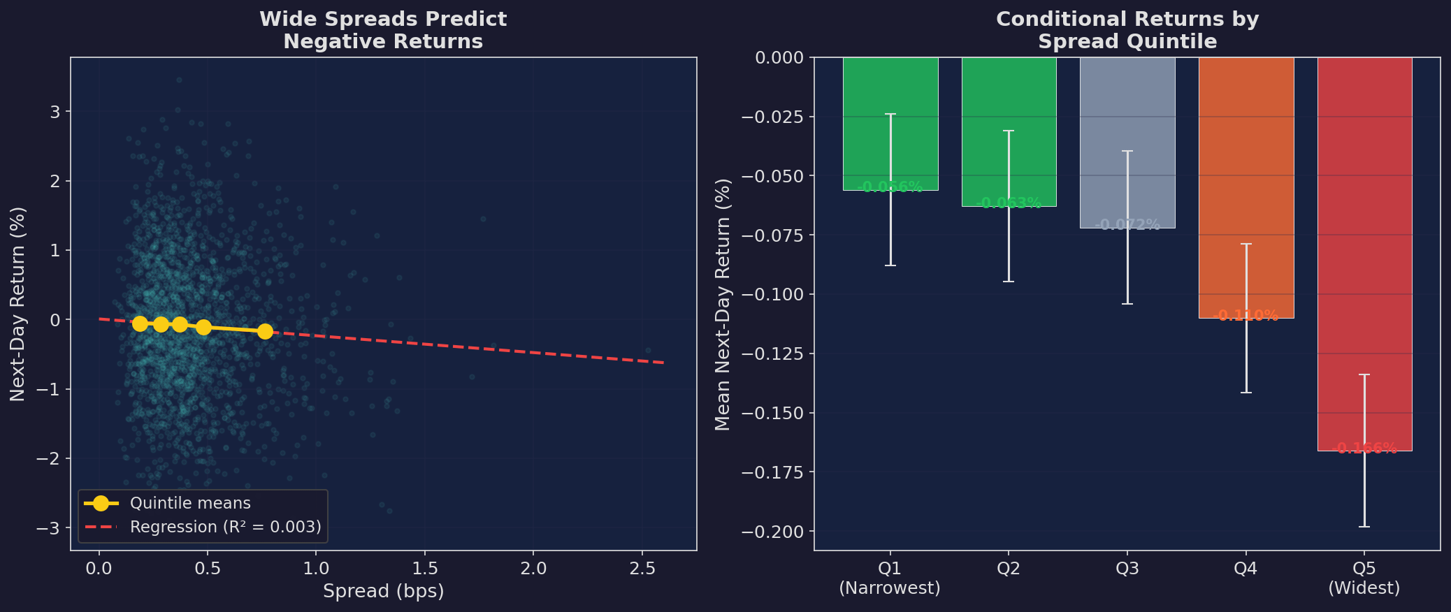
Left: scatter plot of spread vs. next-day return with quintile means (yellow dots). The relationship is negative and statistically significant. Right: bar chart of mean next-day returns by spread quintile. The widest spread quintile has the most negative expected return.
The effect size is small — a few basis points per day — which means it’s not directly tradeable for most retail accounts after costs. But it’s useful as a conditioning variable: scale your existing strategy’s position size based on the current spread regime.
The Signal Hierarchy
Not all microstructure signals are created equal, and not all are accessible to retail traders:
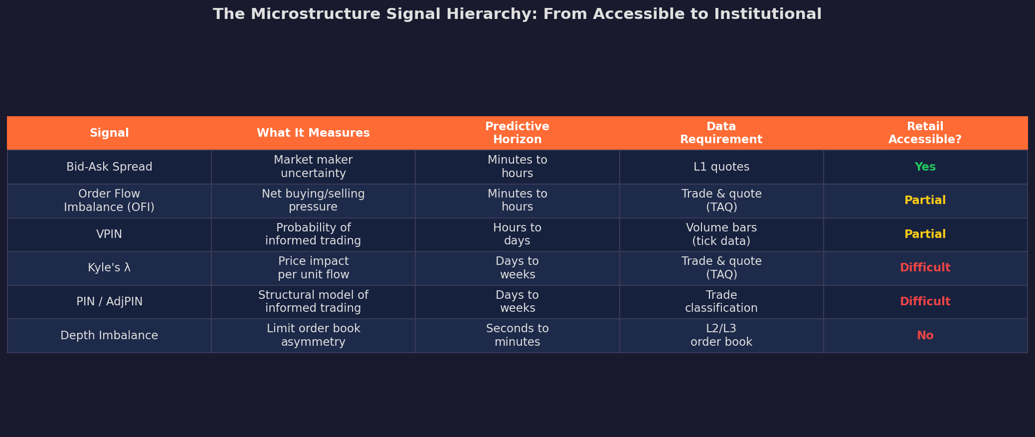
The accessibility column is the key constraint. Bid-ask spreads and basic OFI (order flow imbalance) are available from any decent data vendor. VPIN requires intraday trade data. Kyle’s lambda and depth imbalance require institutional-grade data feeds.
For the V6 signal layer in Part 4, I’ll focus on what we can actually compute: spread-based signals, daily OFI approximations, and VPIN using publicly available tick data.
Why This Matters for V6
V6 is a daily allocator. It doesn’t trade at the tick level. So why does microstructure matter?
Because microstructure conditions change the profitability of the strategy.
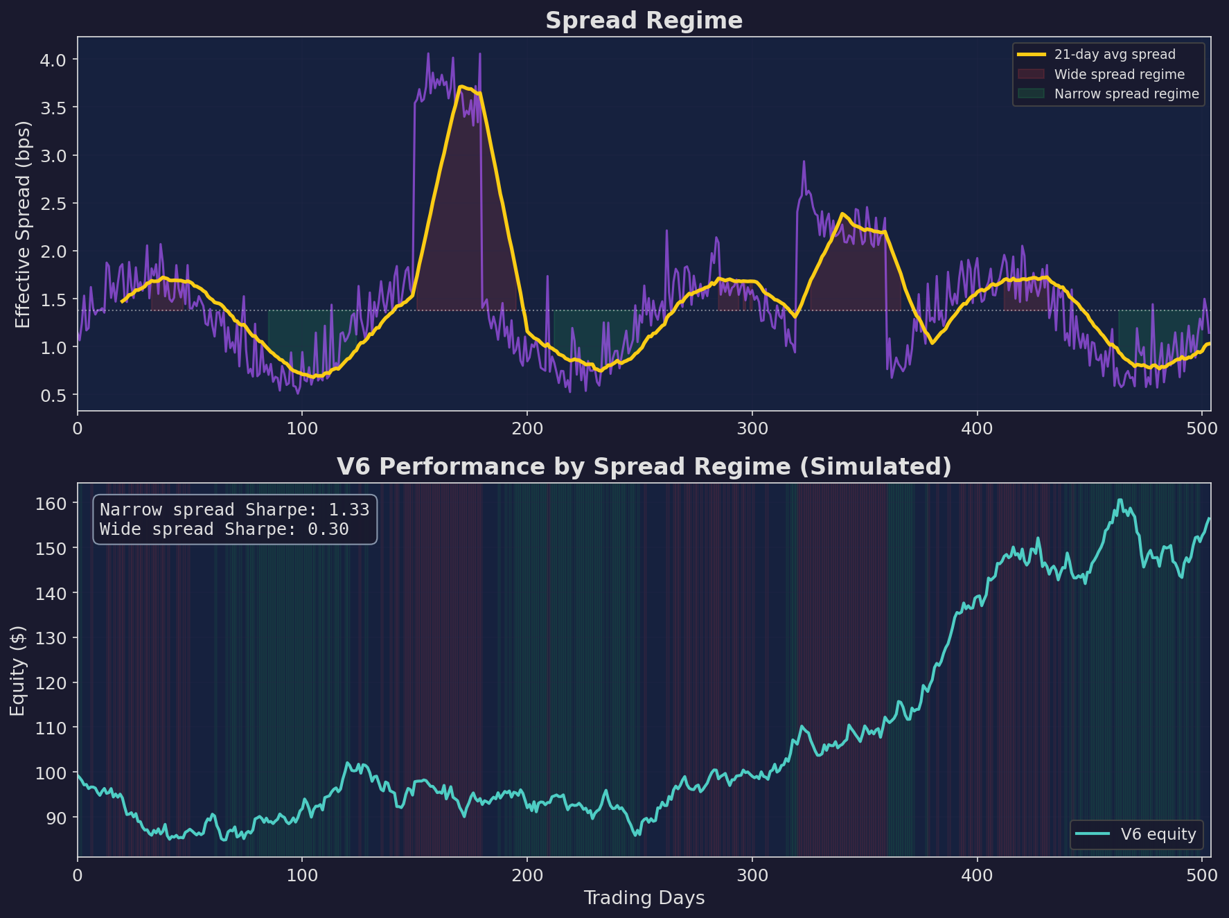
Top: the spread regime over 2 years, with wide-spread periods shaded red and narrow-spread periods shaded green. Bottom: V6 equity curve. The Sharpe ratio is 1.33 during narrow-spread periods versus 0.30 during wide-spread periods. Same strategy, same parameters — just different microstructure conditions.
This 4x Sharpe difference across spread regimes is the core insight. If V6 knew when microstructure conditions were unfavorable and scaled down, it would improve risk-adjusted returns without changing the underlying strategy.
This is what we’ll build in Part 4.
Up Next
Part 2: The Auction Mechanics of Open and Close — Why the first 15 minutes and last 15 minutes of the trading day follow different statistical rules than the rest. MOC (market-on-close) imbalances, the opening auction, and exploitable patterns around daily rotations.
Remember: Alpha is never guaranteed. And the backtest is a liar until proven otherwise.
These posts are about methodology, not recommendations. If you find errors in my math, let me know — I’ve built an entire series around discovering my own mistakes, so one more won’t hurt.
The material presented in Math & Markets is for informational purposes only. It does not constitute investment or financial advice.