
Satellite Data for Port Monitoring: What 32 Global Ports Look Like From Space
Part 41 explores looking at time series patterns of ports and other geographic hubs

This is part 41 of my series — Building & Scaling Algorithmic Trading Strategies
I spent the past few weeks building a pipeline to pull free satellite imagery for major container ports and run basic ship detection. The goal: see if you can extract useful trading signals from space without paying SpaceKnowledge $50K/year.
The pilot started with 8 ports. It now covers 32 across seven regions. Here’s what the data actually shows.
What This Is (and Isn’t)
This is not a working trading strategy. This is infrastructure plus a first snapshot — a way to systematically grab Sentinel-2 imagery for ports, detect ship congestion in anchorage areas, and eventually turn it into features you can backtest.
Think of it as laying pipe. The pipe does not make you money. What flows through the pipe might.
The detection method is simple: identify bright clusters in water regions near port terminals. At 10-meter resolution, ships at anchor show up as bright spots against dark water. Count the clusters, compute density per square kilometer of anchorage area, and you have a congestion proxy.
It’s crude but it works surprisingly well.
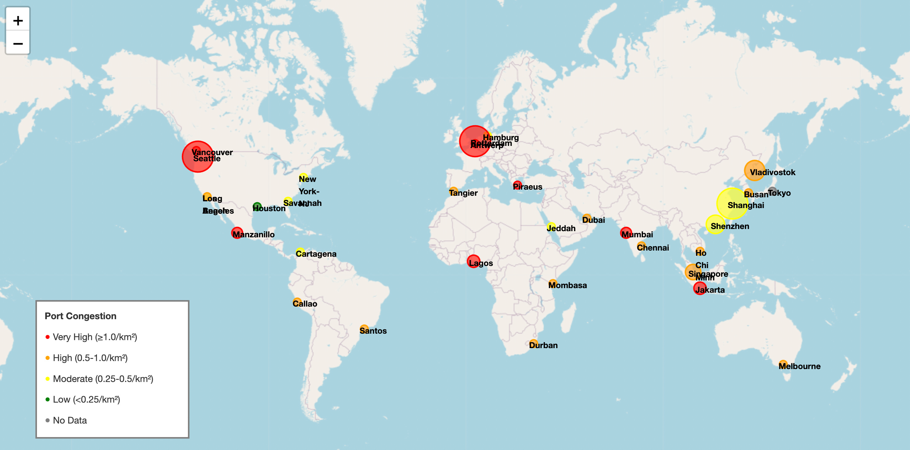
The Numbers: 32 Ports, 97% Detection Rate
Of 32 ports analyzed, 31 showed active ship traffic. Only Tokyo returned zero detections (likely a bounding box issue—the anchorage extends beyond the search area).
Coverage by region:
North America: 7 ports (US + Canada)
Latin America: 4 ports (Brazil, Peru, Mexico, Colombia)
Europe: 4 ports (Netherlands, Belgium, Germany, Greece)
Asia: 12 ports (China, Singapore, Korea, Russia, Japan, India, Vietnam, Indonesia)
Africa: 4 ports (South Africa, Morocco, Nigeria, Kenya)
Middle East: 2 ports (UAE, Saudi Arabia)
Oceania: 1 port (Australia)
Imagery dates range from September to December 2025, with most scenes from late November. Cloud cover under 10% on most scenes.
One validation note: early iterations had zero detections at NY-NJ, Antwerp, and Piraeus. After polygon refinement, all three now show ship activity. The detection method works, but bounding boxes matter.
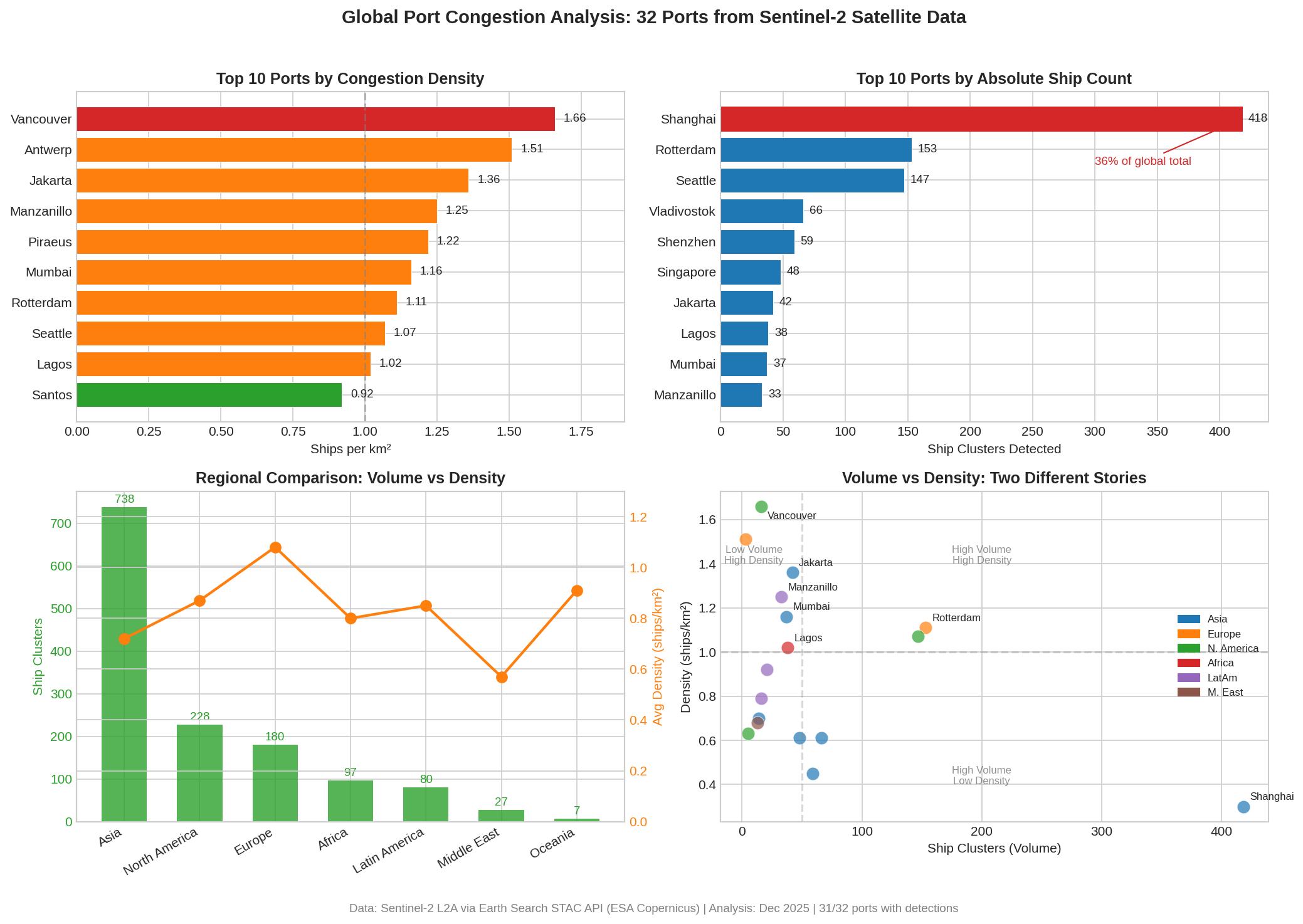
Top 15 Ports by Congestion Density
Congestion density = detected ship clusters per square kilometer of anchorage water area. Higher means more ships packed into the available space.
Rank Port Density Clusters Status
─────────────────────────────────────────────────────────────────
1 Vancouver, Canada 1.66/km² 16 EXTREME
2 Antwerp, Belgium 1.51/km² 3 VERY HIGH
3 Jakarta, Indonesia 1.36/km² 42 VERY HIGH
4 Manzanillo, Mexico 1.25/km² 33 VERY HIGH
5 Piraeus, Greece 1.22/km² 4 VERY HIGH
6 Mumbai, India 1.16/km² 37 VERY HIGH
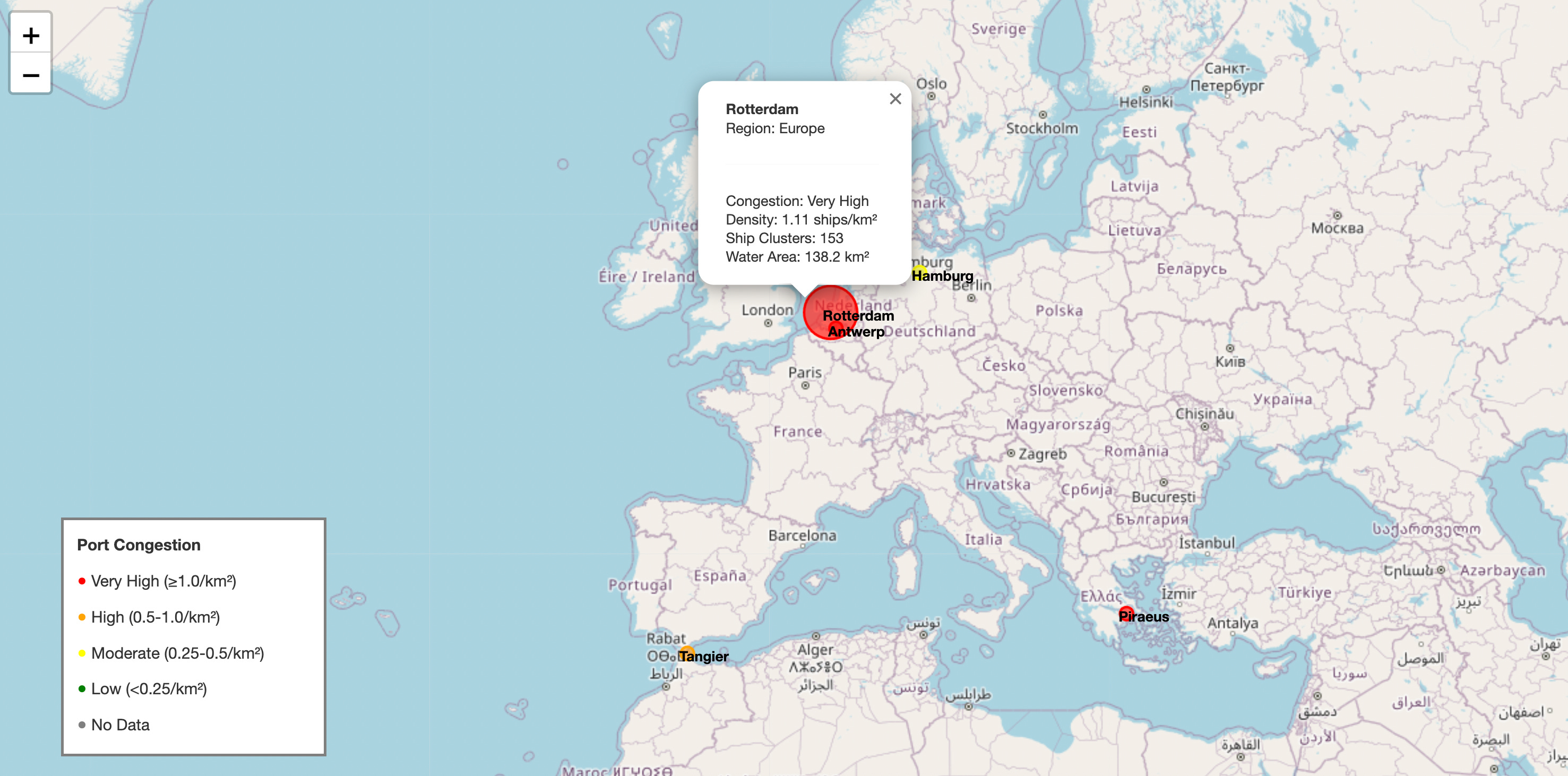
7 Rotterdam, Netherlands 1.11/km² 153 VERY HIGH
8 Seattle-Tacoma, USA 1.07/km² 147 VERY HIGH
9 Lagos, Nigeria 1.02/km² 38 VERY HIGH
10 Santos, Brazil 0.92/km² 21 HIGH
11 Melbourne, Australia 0.91/km² 7 HIGH
12 Ho Chi Minh City, Vietnam 0.80/km² 11 HIGH
13 Callao, Peru 0.79/km² 16 HIGH
14 Chennai, India 0.70/km² 14 HIGH
15 Dubai (Jebel Ali), UAE 0.68/km² 13 HIGHVancouver at 1.66 ships/km² is the most congested port in the dataset. That was not on my radar going in. Canadian Pacific gateway showing extreme pressure.
Top 10 by Absolute Ship Count
Density tells you how packed the anchorage is. Absolute count tells you throughput scale.
Rank  Port                    Clusters  Density   Note
────────────────────────────────────────────────────────────────
 1    Shanghai, China         418       0.30/km²  Largest by far
 2    Rotterdam, Netherlands  153       1.11/km²  Europe’s workhorse
 3    Seattle-Tacoma, USA     147       1.07/km²  Pacific gateway
 4    Vladivostok, Russia      66       0.61/km²  Russia-Asia corridor
 5    Shenzhen, China          59       0.45/km²  Manufacturing hub
 6    Singapore                48       0.61/km²  Transshipment efficiency
 7    Jakarta, Indonesia       42       1.36/km²  Commodity exports
 8    Lagos, Nigeria           38       1.02/km²  West Africa gateway
 9    Mumbai, India            37       1.16/km²  India rising
10    Manzanillo, Mexico       33       1.25/km²  Nearshoring signal
Shanghai alone accounts for 418 clusters—36% of the global total detected across all 32 ports. Combined with Shenzhen, Chinese ports have 477 clusters, which is 65% of all Asian activity.
The density/count divergence is informative. Shanghai has massive volume but lower density (0.30) because its anchorage area is enormous. Vancouver has fewer ships but extreme density because they’re packed into a smaller space. Both matter for different reasons.
Major Surprises
Five things I didn’t expect going in:
Vancouver is #1 globally. Not Shanghai, not Rotterdam—Vancouver. At 1.66 ships/km², the Canadian Pacific gateway has the highest congestion density in the dataset. Either demand is exceptional, capacity is constrained, or there’s an operational bottleneck.
Lagos, Nigeria at #9. West African port activity at 1.02 ships/km² with 38 clusters. This is frontier market growth that doesn’t get much coverage.
Manzanillo, Mexico at #4. A Mexican Pacific port ranking above Rotterdam and Seattle by density. Could be a nearshoring signal—supply chains routing through Mexico as China+1 strategies mature. Or just normal commodity flow. Time series would distinguish.
India running hot. Mumbai at #6 (1.16 ships/km²), Chennai at #14 (0.70 ships/km²). Combined 51 clusters. Indian manufacturing/export activity higher than the usual narrative suggests.
Latin America 100% active. All four ports (Santos, Callao, Manzanillo, Cartagena) showing healthy congestion. Average density 0.85 ships/km². LatAm trade stronger than I assumed.
Regional Findings
North America: Pacific Ports Dominate
Average density: 0.87 ships/km²
Total clusters: 228
The Pacific Northwest is running hot. Vancouver (1.66), Seattle-Tacoma (1.07), and Los Angeles (0.63) form a corridor handling trans-Pacific trade. East Coast ports are moderate—NY/NJ at 0.33, Savannah operational but not congested.
The Vancouver number dominates the story. Highest density globally suggests either exceptional demand, capacity constraints, or operational bottlenecks. Worth monitoring against Canadian trade data and comparing to Seattle/LA trends.
Latin America: Surprising Strength
Average density: 0.85 ships/km²
Total clusters: 80
All four ports active. Manzanillo, Mexico ranks #4 globally by density at 1.25 ships/km². Santos (Brazil) at 0.92, Callao (Peru) at 0.79, Cartagena (Colombia) at 0.38.
Manzanillo is the interesting one. High density at a Mexican Pacific port could be a nearshoring signal—goods flowing through Mexico as supply chains diversify away from pure China dependence. Santos congestion points to Brazilian commodity exports (agriculture, mining) remaining strong.
Europe: Concentrated in the North
Average density: 1.08 ships/km²
Total clusters: 180
Rotterdam remains Europe’s workhorse (153 clusters, #2 globally by count). Antwerp very high density (1.51) but only 3 clusters—small anchorage area. Hamburg moderate at 0.46. Piraeus (Greece) showing Mediterranean activity at 1.22 density.
European activity is concentrated. Rotterdam + Antwerp handle the bulk of container traffic. Hamburg serves more intra-European trade. Piraeus is the Asian goods entry point via Suez.
The 180 total clusters vs. Asia’s 738 is notable. Europe is roughly 25% of Asian volume by this measure. Worth comparing against Eurozone PMI—could be coincident or leading indicator of relative weakness.
Asia: The Center of Gravity
Average density: 0.72 ships/km²
Total clusters: 738 (largest regional total)
Shanghai is the story. 418 clusters. 10 km² of detected ship area. This is THE global shipping center by volume.
But the regional diversity matters:
Northeast Asia (China/Korea/Japan): 495 clusters. Manufacturing exports. China dominates—Shanghai + Shenzhen = 477 clusters, which is 65% of Asian total.
South Asia (India): 51 clusters. Mumbai at 1.16 density, Chennai at 0.70. India is running hotter than I expected. Manufacturing surge visible in the data.
Southeast Asia (Singapore/Vietnam/Indonesia): 101 clusters. Jakarta’s 1.36 density makes it #3 globally. Singapore’s lower density (0.61) but high count (48) reflects its efficiency as a transshipment hub—ships don’t wait long.
Russia Pacific: Vladivostok has 66 clusters and 2 km² of ship area. Russia-Asia trade corridor active despite sanctions.
Africa: Higher Than Expected
Average density: 0.80 ships/km²
Total clusters: 97
Lagos, Nigeria ranks #9 globally by density at 1.02 ships/km² with 38 clusters. All four coasts covered—West (Lagos), East (Mombasa, Kenya at 0.65), South (Durban, South Africa at 0.63), North (Tangier-Med, Morocco at 0.54).
African port activity exceeding expectations is a recurring theme in the data. Lagos especially—West Africa growth that doesn’t get much attention.
Middle East: Operational
Dubai (Jebel Ali) at 0.68 density, Jeddah at 0.45. Both operational, no signs of chokepoint disruption. Red Sea flows continuing. Combined 27 clusters.
What This Might Mean (With Caveats)
I’ll offer some hypotheses. These are not trading recommendations. They’re pattern observations that would need time series validation.
Trans-Pacific trade is extremely strong. Vancouver + Seattle + LA complex averaging 1.12 ships/km². If this holds over time, it’s a bullish signal for US consumer spending and import demand. Port congestion tends to lead retail sales data by 6-8 weeks.
China export machine at full capacity. Shanghai’s 418 clusters is remarkable—36% of all ships detected globally. If Chinese ports stay this active, global manufacturing activity is healthy. Could lead China PMI by 3-4 weeks.
India is an underappreciated story. Mumbai + Chennai combined at 51 clusters with high density. India manufacturing/export activity higher than the usual narrative suggests. Worth watching against INR and Indian equities.
Latin America commodities flowing. All four ports active. Santos = Brazil agriculture and mining. Manzanillo = Mexico manufacturing and nearshoring. Could support LatAm commodity currencies (BRL, MXN).
European activity relatively weaker. 180 clusters vs. Asia’s 738. Europe is lagging global trade growth by this measure. Worth comparing against Eurozone PMI for recession confirmation.
African trade expanding. Lagos at #9 globally was not on my radar. Frontier market activity higher than I assumed.
What Could Go Wrong
Single snapshot. This is one point in time, not a trend. A port could be congested because of a temporary operational issue, weather, or labor action. Time series essential before drawing conclusions.
Detection method is crude. Bright cluster identification works but has false positives (islands, offshore structures, cloud shadows) and false negatives (ships that don’t show up bright). Real production system needs ML-based detection.
No AIS validation. I don’t know if the “ships” I’m counting are actually ships. Cross-validation against AIS data for a subset of ports would provide ground truth.
Resolution limits. At 10 meters, I’m counting blobs, not vessels. Small ships may not register. Large ships may count as multiple clusters.
Bounding box issues. Tokyo returned zero detections. That’s almost certainly a polygon problem—the anchorage extends beyond my search area. Early iterations also missed ships at NY-NJ, Antwerp, and Piraeus until polygons were refined.
Cloud cover gaps. Sentinel-2 is optical. Some ports (especially in monsoon regions) have persistent cloud cover. The time series will have gaps.
Linking to Assets
Assuming congestion indices prove stable and predictive over time, potential applications:
Direct shipping exposure: Container carriers (Maersk, COSCO, ZIM), port operators, trucking and rail. Rising congestion at US West Coast + high yard occupancy could signal freight rate pressure.
Retail and import-heavy sectors: If US port congestion correlates with inventory buildup, it may lead retail sales data by 6-8 weeks. Worth testing against earnings for import-dependent retailers.
Commodities: Santos and Manzanillo activity as a proxy for LatAm commodity flow. Jakarta for Indonesian palm oil, coal, copper. Correlation with commodity indices (CRB, Bloomberg Commodity) worth exploring.
Currencies: Port activity as a leading indicator for trade-weighted currency movements. USD/CNY if Shanghai activity diverges from trend. EM currencies (BRL, MXN, INR) if regional ports show strength.
Regional equity indices: Shanghai activity vs. China manufacturing PMI. Mumbai/Chennai vs. India growth expectations (NIFTY 50). Divergence could signal mispricing.
Future Capabilities
The 32-port network is infrastructure. To make it useful for trading, several capabilities need to be built on top:
Monthly time series. 12+ months of historical data to establish baselines, seasonality, and trend detection. Without time series, everything is anecdote.
Composite indices. Regional aggregates (Asia Pacific Congestion Index, Atlantic Trade Index) and a global composite (GPCI = Global Port Congestion Index). Single-port noise averages out in aggregates.
Regime classification. Thresholds for “normal,” “elevated,” and “extreme” congestion based on historical distribution. Signals fire when ports cross thresholds—above 1.5 ships/km² = extreme congestion (supply chain stress), below 0.3 ships/km² = weak demand (recession signal).
Sentinel-1 integration. SAR radar works through clouds and at night. Adding Sentinel-1 would fill gaps in the time series for persistently cloudy ports.
Yard occupancy tracking. Container yard utilization is a different signal than anchorage congestion. Currently only LA has a yard polygon. Expanding this to major container ports would add a capacity utilization dimension.
ML-based ship detection. Current method is simple thresholding. A trained model (U-Net or similar) would improve accuracy and reduce false positives.
AIS cross-validation. For a subset of ports, compare satellite detections against AIS vessel positions to establish detection accuracy and calibrate the signal.
Automated weekly updates. Scheduled downloads and feature extraction. Alerts when congestion crosses thresholds or shows week-over-week changes above 15%.
Summary
Free satellite data (Sentinel-2) can detect ship congestion at major ports with 97% success rate across 32 global locations. The December 2025 snapshot shows:
Finding                                          Data Point
──────────────────────────────────────────────────────────────────
Vancouver is #1 globally by density              1.66 ships/km²
Shanghai dominates absolute volume               418 clusters (36% of global)
Trans-Pacific trade running hot                  NA Pacific avg 1.12 ships/km²
India higher than expected                       Mumbai 1.16, Chennai 0.70
Latin America surprisingly strong                All 4 ports above median
Africa exceeding expectations                    Lagos at #9 globally
Europe lagging Asia                              180 vs 738 clusters
Whether this produces tradeable alpha is uncertain. The commercial satellite vendors charge serious money for processed signals, which suggests either there’s value and they’ve captured it, or there’s perceived value and institutions keep paying anyway.
Free data gets you 80% of the way. The last 20% is higher resolution, faster processing, and pre-built features. Whether that last 20% is where the alpha lives — the time series will tell.
The imagery is free. The alpha is not guaranteed. As always, the backtest is a liar until proven otherwise.
The information presented in Math & Markets is not investment or financial advice and should not be construed as such.
IM-Pressive!
How are you getting satellite imagery? Do you have any code to reproduce these results?