
Every Coin Flip Passes the Fractal Test
Why you can't see volatility clustering by just zooming

My next post in the Tech Schism will be on July 25th, after Alphabet’s earnings on July 22nd, where the term structure question should resolve itself.
Taking a break from the Tech Schism series for something different and interesting.
Doc McGraw sent me a chart last week and shared a hunch. Through the correlation unwind in June — and the not-quite-unwind since — he kept watching the same thing intraday: the tape would travel a long way, VIX would lurch from 16 to 17-and-change and settle back near 16-and-a-half, and by the close realized vol had barely shown up for all that motion. The next day, the same figure at a different size. Within the hour, again. So he pinged me saying “this looks fractal”.
He’s right. There’s a wrinkle underneath it, though, and it’s kinda important. The fractal that’s easy to draw isn’t the same object as the one he’s watching. Pinning down the difference is what turns a cool metaphor into something you can actually trade.
Doc wrote the market side of this — the dispersion coil, the wound spring, why the tremors are real evidence and still not a timing signal.
🌀 The Market’s Been Rehearsing: What Fractal Days Are Actually Telling Us About the S&P 500 Freebie
My post is basically the machinery underneath it all: what the fractal actually is, and where the eye gets fooled.
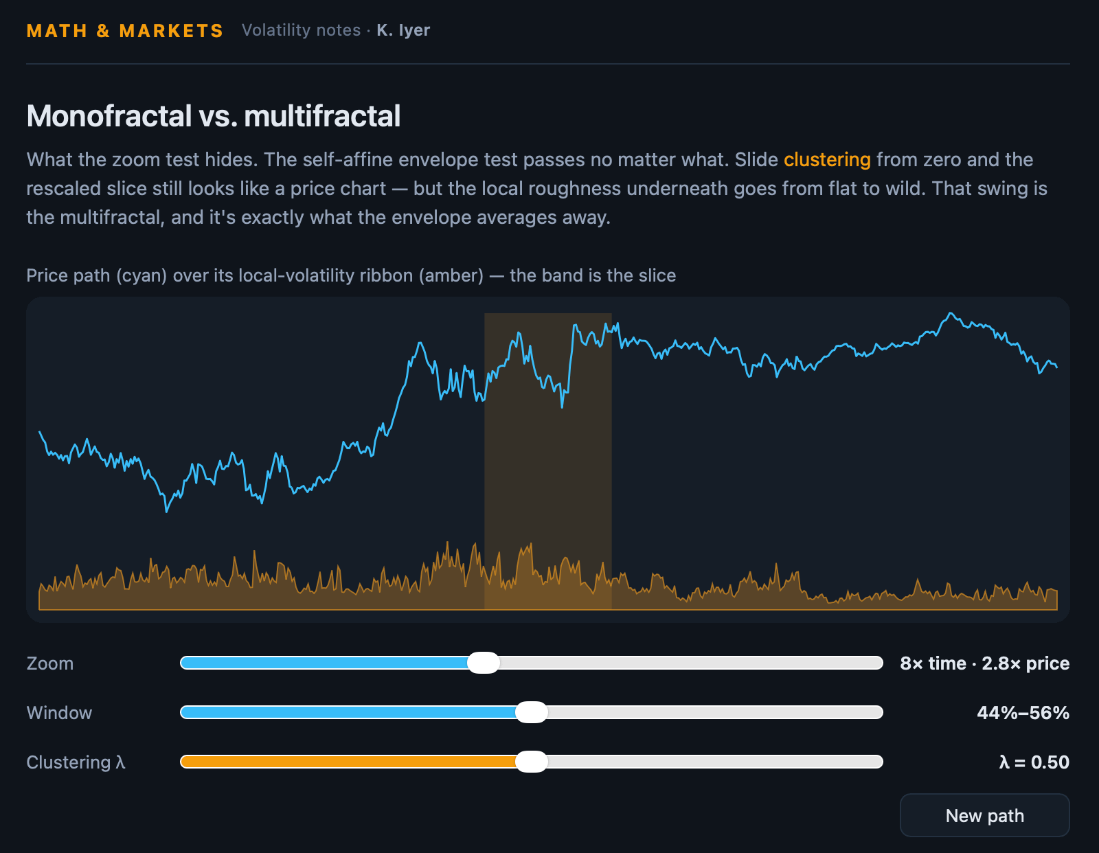
And before we dive in, here’s the demo to play with:
The easy answer
Dig into “markets are fractal” and you land quickly on Mandelbrot, who was careful about an important distinction. A coastline is self-similar: zoom in and you get the same jaggedness, with no preferred direction — it scales the same in every axis.
A price chart is self-affine: it has a distinguished axis, because time is not price. Zoom in and you can’t recover the look by stretching both axes equally. You have to stretch them by different amounts.
Empirically, price wanders as roughly the square root of time, so to make a slice look like the whole you stretch time by some factor k and price by only √k. Mandelbrot insisted on “self-affine” for exactly this reason, and it’s the precise version of “the chop looks the same zoomed in or out.”
A little more precisely: a process is self-affine with exponent H if rescaling time by any factor c reproduces the same distribution once you rescale price by c^H — in shorthand, X(ct) has the same law as c^H · X(t). The same H then governs every moment of the increments: E[ |X(t+Δ) − X(t)|^q ] ∝ Δ^(qH) for all q. For a price series H = ½, which is just the √time law — variance grows linearly in time, the price-axis rescale factor is √c, and the exponent qH = q/2 traces a straight line through the origin. That single straight line is the entire content of the demo.
Doc built a demo that shows it cleanly. Drag the zoom, and a slice of the path, rescaled by k in time and √k in price, reassembles into something indistinguishable from its parent. Stretch both axes equally instead and the slice goes flat — proof, apparently, that the market lives by the √-scaling law.
It was correct but it’s got a caveat.
That path is a coin flip
Look at what generates the demo’s curve: a fractional Brownian path tuned to a Hurst exponent of one-half. H = ½ is not arandom walk near the market. It is the random walk. Independent increments, variance growing linearly in time, price spreading as √time. Brownian motion is the continuous limit of coin flips, stacked.
So the demo proves that markets share a property with a fair coin. A random walk passes the rescale test perfectly — of course it does; √-scaling is its definition. Which means passing the test tells you nothing about the part Doc actually noticed. The test is necessary and nowhere near sufficient.
And a coin flip is missing everything interesting. No fat tails — Brownian increments are Gaussian. No volatility clustering — the increments are independent, so a quiet stretch carries no information about the next one. And, most to the point, uniform roughness: every window of a Brownian path looks equally jagged, because every increment is drawn from the same distribution. The market is not like that. Some hours are dead and some are violent, and the violence is in clumps. That variation where the roughness itself changing from stretch to stretch is the whole game, and no single scaling exponent can produce it. One H gives you one roughness, everywhere. You need a spectrum.
Turning the difference into a knob
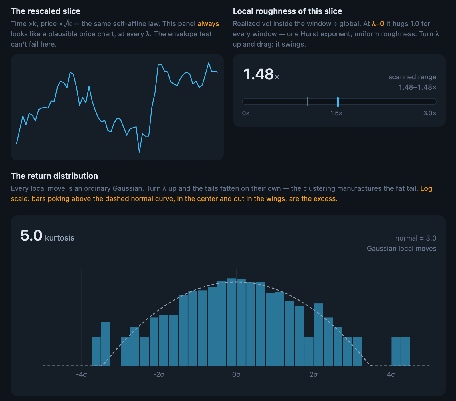
Here’s the counter-demo. It’s the same path-and-slice machinery as Doc’s and the same √-scaling rescale but with one addition. I’ve also added a slider for clustering, and a meter that reads the realized volatility of whatever slice you’re sitting on, divided by the path’s global average.
Interactive — “Monofractal vs. multifractal”: pull λ from zero and drag the window across the path.
At λ = 0 you are looking at Doc’s demo — Brownian motion — and the roughness meter reads about 1.0× no matter where you drag the window. Every slice is equally rough. That flat meter is what a single Hurst exponent means.
Turn λ up and watch two things happen at once. The rescaled slice still looks like a price chart — the eyeball test still passes, exactly as before; that’s the trap, restated as a control. But the meter starts swinging: 0.4× on a calm stretch, 3× a few windows to the left. It’s the same visual test, identical to your eye.
But what matters is now completely different. The increments here have a local variance set by a lognormal multiplicative cascade — Mandelbrot’s original multifractal object — and the cascade is normalized so the global √time envelope still matches Brownian. Both processes pass the picture test. The difference lives entirely in the quantity the picture test integrates away.
The distinction, stated exactly
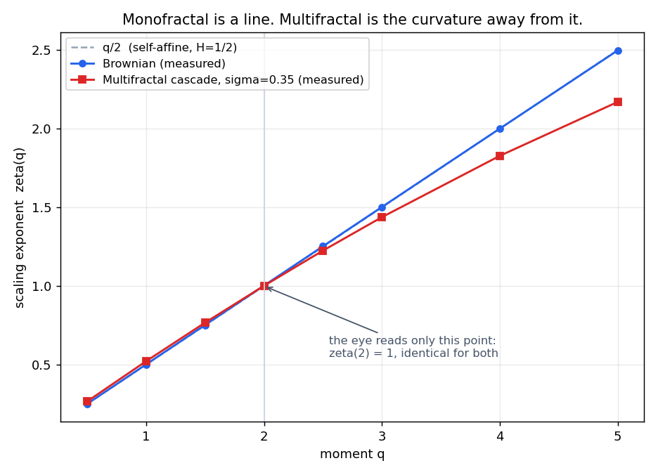
Define the increment-scaling exponent ζ(q) by E[ |ΔX|^q ] ∝ Δ^(ζ(q)). A monofractal has ζ(q) = qH — a straight line, one slope, one H. A multifractal has ζ(q) concave: bent downward, so the effective H you’d read off depends on which moment you look at. Small moves and large moves scale by different exponents, and that spread of exponents is the multifractal spectrum.
Now notice what the rescale-and-look test actually measures. Matching the width of a slice to its parent is a statement about the spread of the path — variance, q = 2. It reads a single point on the curve, ζ(2) = 2H ≈ 1, and Brownian and the cascade land on the same point by construction. Multifractality is the curvature of ζ(q) away from the straight line, and no one-point test can measure how a curve bends. That is precisely why the eye can’t see it and the roughness meter can.
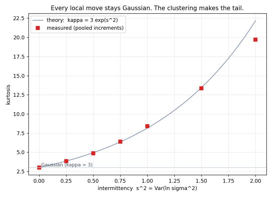
The fat tail falls out of the same structure, in closed form. Write each move as r = σ · ε, with ε a standard Gaussian and σ the local vol the cascade assigns it. The kurtosis is κ = E[r⁴] / E[r²]² = 3 · E[σ⁴] / E[σ²]². By Jensen the ratio is at least 1, so κ ≥ 3 for any varying volatility — equality only when σ is constant, which is the coin flip. Make the vol lognormal with Var(ln σ²) = s²and it’s exact: κ = 3 · e^(s²), excess kurtosis 3(e^(s²) − 1). The tail isn’t bolted on. It’s e^(s²), and s² — the dispersion of the volatility itself — is the intermittency dial. Push it in the widget and the return histogram lifts off the Gaussian curve exactly this way, kurtosis climbing while every local move stays ordinary. (A finite stretch of tape realizes a noisier, smaller number; the full e^(s²) is the limit you converge toward, which is itself why tail risk reads as a large-sample phenomenon.)
Why “multifractal,” and not just GARCH
Volatility clustering isn’t news; GARCH has modeled it since the 1980s. But GARCH clusters with a built-in half-life — a characteristic timescale, past which the memory decays exponentially. What Doc described has no such scale. The five-minute chop and the three-week coil were the same figure. That scale-free clustering — the same statistical texture at every zoom, memory decaying like a power law instead of an exponential — is the multifractal signature, and it’s precisely what a single-timescale model smooths over.
Two names, if you want to dig. The framework is Mandelbrot’s Multifractal Model of Asset Returns (with Fisher and Calvet, 1997). The version that made this estimable and forecastable is Calvet and Fisher’s Markov-Switching Multifractal (2004), which out-forecasts GARCH as you push the horizon out, because it carries volatility memory at many scales at once instead of one.
The second fractal
Doc was looking at VIX specifically, but VIX isn’t even the price path. The self-affine √time story is a statement about the underlying’s returns. VIX is the volatility process — mean-reverting, forward-looking, a different animal — and the volatility process has its own fractal (but a rougher one). The “volatility is rough” work (Gatheral, Jaisson, Rosenbaum, 2018) puts log-vol at a Hurst exponent near 0.1: violently anti-persistent, far spikier than the H = ½ of the price path.
So there are two fractals hiding in that chart, but the most valuable one in the demo is neither. It’s the plain price envelope — the least interesting object in the room.
What he actually saw
Which finally explains the thing that started this: realized vol not showing up for all that intraday travel. If variance shows up in scale-free bursts, then most windows are calm, a few are savage, and the intraday range you feel is dominated by the near-misses rather than the hits. The moves that do come reverse before they accumulate, because implied vol runs overshoot-and-revert on its own fast clock. A model with one clustering timescale — or worse, the flat-roughness intuition that a self-affine cartoon quietly invites — will systematically misjudge how often the burst actually lands. The multifractal and rough-vol machinery exists to price exactly that gap. It isn’t a mood about markets being complicated; it’s the specific reason the intraday thrash and the realized print keep disagreeing, and it pays to whatever extent you can call the burst better than the crowd.
So: is a price chart fractal? Yes — and so is a coin flip, and that’s the point.
Looking the same when you rescale is a property Brownian motion already has. What Doc noticed is the property it doesn’t. That’s what you trade on.
Code
All code can be found at https://github.com/kniyer/multifractal
ζ(q) — Brownian tracks q/2 to three decimals (0.502, 1.003, 1.502, 2.001…), the cascade bends below it at high q (2.17 vs 2.50 at q=5). And both hit ζ(2) ≈ 1.00 — the shared envelope. That’s the whole thesis in one figure: they agree at exactly the one point the eye can read, and diverge everywhere else.
Kurtosis — measured pooled kurtosis sits right on 3·e^(s²): 3.01, 4.88, 8.40, 13.35 against theory 3.00, 4.95, 8.15, 13.45. At s²=2 it reads 19.7 vs 22.2 — the finite-sample shortfall, which is exactly the caveat your article already flags (the full e^(s²) is the limit you converge toward). The sim demonstrates the caveat instead of just claiming it.
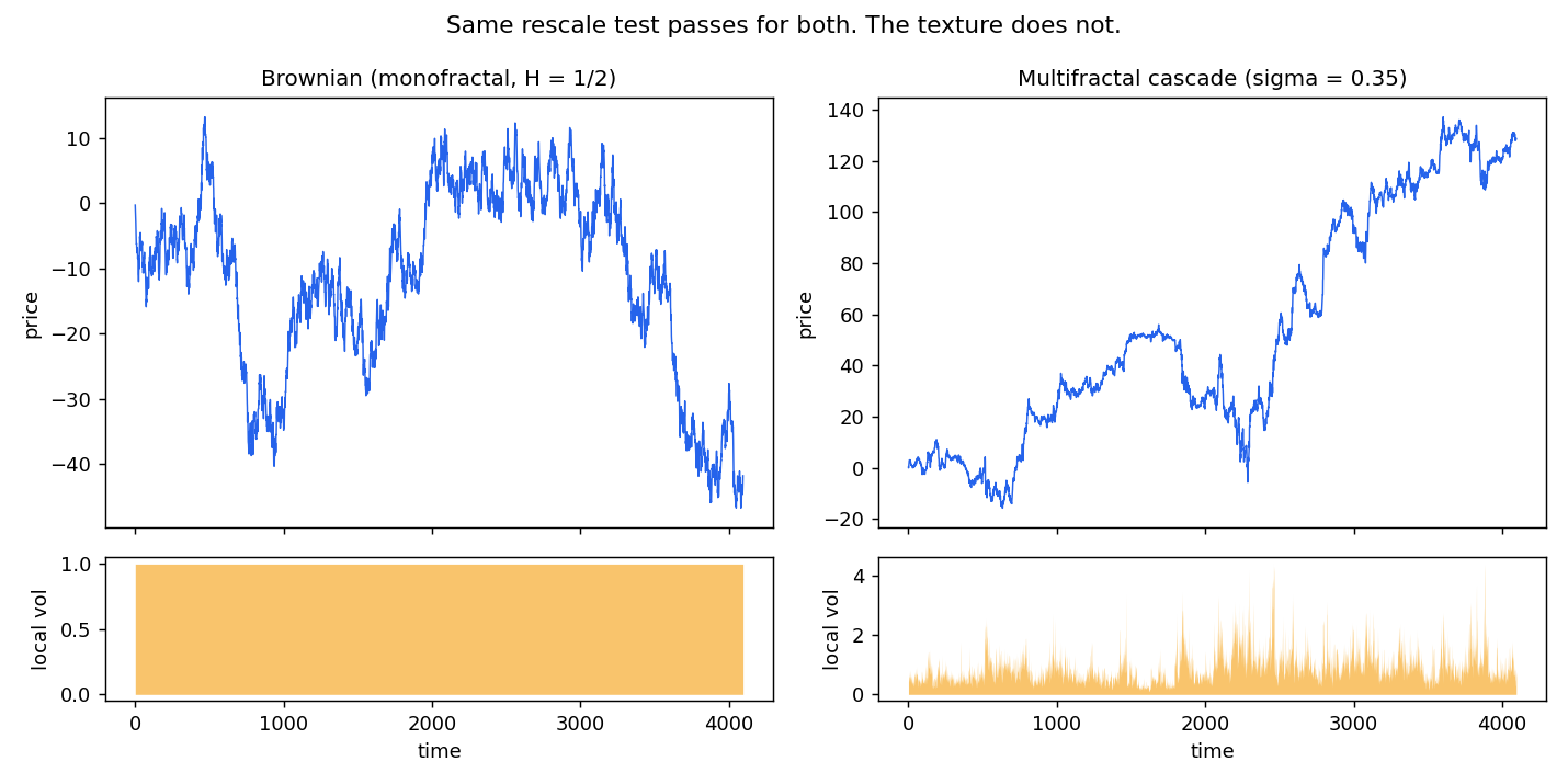
Paths — Brownian’s local vol is a flat bar; the cascade’s clusters into bursts. Same rescale test, different texture.
For what this looks like right now — dispersion near record lows, single-stock vol against an index in the teens, and the case that elevated vol-of-vol is a structure signal rather than a timing one — read Doc’s companion piece that I’ve linked to.
As always, not financial advice.